
UI
Create pages and Game UI, lay them out on the canvas, and reuse parts as components.
The UI panel holds every interface in the project. Interface Type switches the list between the two kinds.
| Kind | Is | Size |
|---|---|---|
| Page | A complete screen, such as title, settings, save, history, or gallery | Chosen when the page is created |
| Game UI | Interface that belongs to active gameplay, such as dialog, choices, HUD, shortcuts, and notifications | The project resolution |
A Game UI is created into a slot, and each slot holds one interface. When every slot is taken, open the existing Game UI from the list instead of creating another.
The game opens on the Entry page, and blueprints open the other pages. Game UI appears over the stage on its own once the game starts. How the two are stacked at run time is covered in Interfaces at run time.
Any page can be the entry page. Right-click its card and choose Set as Entry Page, or select the page and click Set as Entry Page in Properties. The card then reads Entry page, and the page that was the entry becomes an ordinary page. Blueprints and Go Page nodes that name either page keep working.
Pages and Game UI can be renamed, duplicated, and deleted. Deleting one removes the elements in it. The entry page cannot be deleted; make another page the entry page first.
The canvas
An interface opens as a tab: the UI Outline on the left, the canvas in the center, Properties on the right, and the insert bar below.
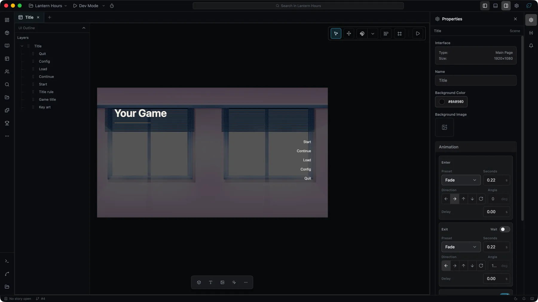
- Choose a widget from the insert bar, then click or drag on the canvas to place it.
- Drag a widget to move it, and use its handles to resize it. Smart Snap aligns widgets with canvas edges, center lines, and nearby widgets.
- The align tools act on the selection's bounding box.
- The frame control draws the safe area of a target device over the canvas, and the play button opens the interface in Dev Mode.
- What lies past the page's edge is drawn under a veil in the canvas color, so an element dragged off the page can still be selected and dragged back. A selected element that its container clips away is dragged by its selection frame. The game shows only what is on the page.
The canvas never crops: the runtime always fits the whole stage inside the window, so what falls outside the safe area stays visible on some devices.
Words
A Text's content, a Button's label and a Text Input's placeholder each take their words from one source, chosen in Properties: Direct, Translation key, or, for a Text and a Button, Blueprint Value.
- On a page, a Text or a Button can show one of the page's Text params instead, chosen under Page param; see Page params.
- Under a Blueprint Value, a list row's Field, a component's Parameter or a Page param, the widget's own words are Sample text: drawn in the editor only and not part of the built game.
- When a blueprint writes the words while the game runs, Properties labels the widget's own words Default value, and lists the blueprints under Written in the game by. Choosing one opens the blueprint with the node that writes selected and brought into view.
How each source is translated is described under Interface text.
Auto fit
A Text widget can shrink its content until it fits the box it is drawn in. Turn on Auto fit in Typography: the size set on the widget becomes a ceiling, and the text is set smaller until the whole of it fits, down to Smallest size. Text that still does not fit at Smallest size is clipped.
Smallest size appears while Auto fit is on. Both properties apply on the canvas and in the running game, and the Sentence and NVL Texts widgets carry them as well.
The Sentence widget has Auto fit on to begin with: a dialogue line is written once and read in every language the game ships in. It is set at the size on the widget until the text reaches the end of the box, and comes down from there as the rest of the line is typed.
Sound
Every element except the interface's root has a Sound section in Properties, above Animation. The section is folded until the element has a sound.
| Sound | Plays when |
|---|---|
| Hover | The pointer moves onto the element. A tap on a touchscreen does not play it. |
| Click | The element is clicked, or activated from the keyboard. |
Choose an audio asset or an asset set for either one; No sound means none is set. The line under a chosen sound, such as Volume 1 · SFX, opens its playback options: Volume, from 0 to 1, and Track. A sound plays on the SFX track unless Track names another, so the player's volume for that track applies. It plays once per hover or click and never loops, whichever track it is on.
One hover or click plays one sound. When elements with a sound are nested, the innermost one plays: a button with its own click sound inside a card plays the button's sound, and a click anywhere else on the card plays the card's. A disabled element plays neither sound.
Sounds play in Dev Mode and in the game. The editor canvas plays none.
An instance of a linked component has no Sound section and plays the sounds set in the component. For a sound that depends on a condition, use the Sound nodes in a blueprint.
Lists
A List draws its Item template once for each row. What a row holds is set with Edit content in the Content section of Properties; the line under the button names the fields.
Edit content opens List content:
- Fields are the values each row has, each with a name and a type: String, Number, Boolean, Image, Color or JSON. A widget inside the item template shows one of them under Field.
- Struct, beside Fields, sets where the fields come from. Custom is the fields written for this List. The other entries are the structs the engine hands out, such as Ending, Save entry and History entry, and those of the plugins that are loaded, such as Gallery entry while the Gallery plugin is enabled.
- Rows are what the canvas draws, and what the game draws while nothing else gives the List its content.
With one of the engine's or a plugin's structs, the fields are those of the rows its nodes hand out: a List that shows the endings from Get Endings has the fields endingId, name, sceneId, sceneName and isReached without writing them. These fields cannot be edited. Row key and the fields shown by the widgets in the item template move to the field of the same name. A Get Field that reads the row keeps the field it had and is reported if the struct has no such field; pick the field again. Choosing Custom again keeps the fields and makes them editable. Every struct and its fields are listed under Structs.
Changes made under Edit content, renaming a field among them, are taken back by Undo like any other edit.
A blueprint that gives a List rows without a field the List declares, such as save entries wired into a List whose Struct is Ending, is reported on the blueprint canvas and in the Problems panel under List fields do not match. The List draws such a field empty. Rows that carry every declared field, with the same name and type, are accepted whatever other fields they have. See the List nodes.
Page params
A page can declare the values it is opened with. Select the page and add them under Params in Properties. Each param has a name, a Type and a Default:
| Type | Holds |
|---|---|
| String | Text used as a value, such as an id or a tag. |
| Text | Words the player reads. A Text or a Button on the page can show it directly. |
| Number | A number. |
| Boolean | True or false. |
| List | Rows for a List. In place of a default it has a Row struct: one of the engine's or a loaded plugin's structs, or Unspecified. It starts empty. |
| JSON | Any JSON value. |
Names are unique on a page. Renaming a param keeps the blueprints that give or read it connected, and a List on the same page that shows it follows the new name. A Game UI has no Params, because the game opens it with nothing.
A param is given a value by:
Go Page,Replace Page,Show LayerandSet Frame Page, which grow one input per param of the page picked in theirPagefield; see App nodes.- A Page widget, whose Properties show one field per param of its page under Params. Words written there for a Text param are translated.
Show Confirm, which givesmessageandbuttons; see Show Confirm.
A param that is not given reads its default. The page uses its params in three ways:
- A Text or a Button shows a Text param chosen under Page param, above the choice of source, with no blueprint. In the game it shows the words the page was opened with. Words a node gives are shown as given; to translate them, give the node its words from
Translation Key TextorGet Text. Words a Page widget gives are translated. When nothing was given, it shows the default, translated. On the page's own canvas it shows the default, or the widget's own words as sample text while the default is empty. Double-clicking such a widget on the canvas shows where its words come from instead of editing them. - A List shows a List param: under Content, set Runtime items to Page props array and choose the param under Param. The fields its item template shows should be in the param's Row struct.
Get Page Paramreads any param in a blueprint, typed by the param; see Get Page Param.
The Confirm page of the Skeleton template uses both kinds: message is a Text param shown by the message text, and buttons is a List param whose Row struct is Confirm button, drawn by the button list.
The project checks report these as warnings:
| Check | Reports |
|---|---|
Undeclared page param (ui/page-prop-undeclared) | A List on a page showing a page prop the page does not declare as a param. The List shows no rows in the game. |
Unknown page param (ui/page-param-unknown) | A Page widget giving a value the page it shows does not declare. |
Missing page text param (ui/page-text-param-missing) | A Text or Button showing a param the page does not declare as Text, or showing a param while it is not on a page. The game shows no words there. |
List not matching its page param (ui/page-param-list-mismatch) | A List showing a page param whose Type is neither List nor JSON, or whose Row struct lacks fields the List shows, with the same name and type. Other fields in the row struct are accepted. |
Missing page param (blueprint/page-param-missing) | A Get Page Param reading a param the page does not declare. |
Components
A selection can be saved to the Component Library and placed again elsewhere. Use a component when a group of widgets is ready to be reused rather than copied.
Params are declared on the component and set on each placement. A String parameter is read by the component's blueprints with Get Component Param. A Text parameter holds words a player reads: a text or a button inside the component picks it under Parameter, and each placement shows its own words on the canvas and in the game, written directly or from a translation key.
Behavior
Widget behavior is written in Blueprints rather than in the canvas. Each interface has its own Blueprint, and the project has one for the whole application: App logic, the first card in the Page list. See Blueprint.